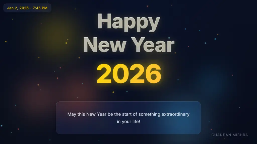
This HTML, CSS, and JavaScript code combination creates a captivating and premium webpage titled “Happy New Year 2026” – a sophisticated animated greeting card that celebrates the new year with stunning visual effects, smooth animations, and interactive elements. The webpage features a modern glassmorphism design, dynamic particle systems, confetti effects, and a mesmerizing year transition animation that transforms 2025 into 2026. Leveraging Google Fonts for elegant typography and pure vanilla JavaScript for all animations, this project delivers a premium, engaging, and aesthetically pleasing user experience without relying on external animation libraries.
Folder Structure
Prerequisite Sites
Codes
HTML
<!DOCTYPE html>
<html lang="en">
<head>
    <meta charset="UTF-8">
    <meta name="viewport" content="width=device-width, initial-scale=1.0">

    <!-- SEO Meta Tags -->
    <title>Happy New Year 2026 - Premium Celebration Greeting</title>
    <meta name="description" content="Celebrate New Year 2026 with this beautiful, premium animated greeting card. Features elegant animations, confetti effects, and inspiring wishes for the new year.">
    <meta name="keywords" content="Happy New Year 2026, New Year greeting, celebration, animated greeting card, New Year wishes">
    <meta name="author" content="Chandan Mishra">

    <!-- Favicon -->
    <link rel="icon" type="image/x-icon" href="data:image/svg+xml,<svg xmlns='http://www.w3.org/2000/svg' viewBox='0 0 100 100'><text y='.9em' font-size='90'>🎉</text></svg>">

    <link rel="preconnect" href="https://fonts.googleapis.com">
    <link rel="preconnect" href="https://fonts.gstatic.com" crossorigin>
    <link href="https://fonts.googleapis.com/css2?family=Inter:wght@300;400;500;600;700;800&display=swap" rel="stylesheet">
    <link rel="stylesheet" href="styles.css">
</head>
<body>
    <!-- Loading Animation -->
    <div class="loader" id="loader">
        <div class="loader-content">
            <div class="loader-spinner"></div>
            <p class="loader-text">Loading Celebration...</p>
        </div>
    </div>

    <div class="container">
        <!-- Premium Background Elements -->
        <div class="background-gradient"></div>
        <div class="light-streaks"></div>
        <div class="bokeh-lights">
            <div class="bokeh bokeh-1"></div>
            <div class="bokeh bokeh-2"></div>
            <div class="bokeh bokeh-3"></div>
            <div class="bokeh bokeh-4"></div>
            <div class="bokeh bokeh-5"></div>
            <div class="bokeh bokeh-6"></div>
        </div>
        <canvas id="particles-canvas"></canvas>

        <!-- Main Content -->
        <div class="content">
            <div class="glitch-wrapper">
                <h1 class="main-heading" aria-label="Happy New Year 2026">
                    <span class="text-line" data-text="Happy">Happy</span>
                    <span class="text-line" data-text="New Year">New Year</span>
                    <div class="year-container" aria-live="polite">
                        <span class="year year-2025" id="year-2025" aria-label="Year 2025">2025</span>
                        <span class="year year-2026" id="year-2026" aria-label="Year 2026">2026</span>
                    </div>
                </h1>
            </div>

            <div class="quote-container" role="region" aria-label="New Year wishes">
                <div class="quote-wrapper">
                    <p class="quote" id="quote-text" aria-live="polite"></p>
                    <div class="typing-indicator" id="typing-indicator" aria-hidden="true">
                        <span></span><span></span><span></span>
                    </div>
                </div>
            </div>
        </div>

        <!-- Date and Time Display -->
        <div class="datetime-display" id="datetime-display" aria-live="polite"></div>

        <!-- Signature -->
        <div class="signature" id="signature">Chandan Mishra</div>
    </div>

    <script src="script.js"></script>
</body>
</html>
The HTML structure defines the webpage with the document type declaration, head, and body sections. It includes meta tags for character set, viewport settings, and sets the title of the webpage. The HTML document links to the CSS file for styling and imports tThe HTML file (index.html) defines the complete structure of the webpage with semantic HTML5 elements. The document includes comprehensive SEO meta tags for search engine optimization and social media sharing, a SVG-based emoji favicon (🎉) embedded directly in HTML, and optimized font loading with Google Fonts preconnect hints.he JavaScript files for the Typing Animation library.
Key HTML Elements:
The HTML structure is semantic, accessible (with ARIA labels), and optimized for performance.
CSS
/* Premium Modern New Year - CSS Variables */
:root {
    /* Premium Color Palette */
    --midnight-blue: #0a1128;
    --midnight-blue-dark: #050a1a;
    --charcoal: #1e1e1e;
    --charcoal-light: #2d2d2d;

    /* Accent Colors */
    --gold: #ffd700;
    --gold-warm: #f4c430;
    --gold-soft: #ffb347;

    --cyan-soft: #7dd3fc;
    --cyan-medium: #38bdf8;
    --cyan-bright: #0ea5e9;

    --coral: #ff7f50;
    --coral-bright: #ff6b6b;
    --coral-soft: #ff8c69;

    /* Text Colors */
    --text-white: #ffffff;
    --text-light: #e5e7eb;
    --text-gray: #9ca3af;

    /* Glassmorphism */
    --glass-bg: rgba(255, 255, 255, 0.05);
    --glass-border: rgba(255, 255, 255, 0.1);
    --glass-shadow: rgba(0, 0, 0, 0.2);
}

/* Reset and Base Styles */
* {
    margin: 0;
    padding: 0;
    box-sizing: border-box;
}

body {
    font-family: 'Inter', -apple-system, BlinkMacSystemFont, 'Segoe UI', 'Roboto', 'Oxygen', 'Ubuntu', 'Cantarell', sans-serif;
    overflow: hidden;
    height: 100vh;
    width: 100vw;
    -webkit-font-smoothing: antialiased;
    -moz-osx-font-smoothing: grayscale;
}

/* Loading Animation */
.loader {
    position: fixed;
    top: 0;
    left: 0;
    width: 100%;
    height: 100%;
    background: linear-gradient(135deg, var(--midnight-blue-dark) 0%, var(--midnight-blue) 100%);
    display: flex;
    justify-content: center;
    align-items: center;
    z-index: 10000;
    transition: opacity 0.5s ease-out, visibility 0.5s ease-out;
}

.loader.hidden {
    opacity: 0;
    visibility: hidden;
}

.loader-content {
    text-align: center;
}

.loader-spinner {
    width: 60px;
    height: 60px;
    border: 3px solid rgba(255, 255, 255, 0.1);
    border-top-color: var(--gold);
    border-radius: 50%;
    animation: spin 1s linear infinite;
    margin: 0 auto 20px;
}

@keyframes spin {
    to {
        transform: rotate(360deg);
    }
}

.loader-text {
    color: var(--text-light);
    font-size: 1rem;
    font-weight: 300;
    letter-spacing: 0.1em;
    animation: pulse 2s ease-in-out infinite;
}

@keyframes pulse {
    0%, 100% {
        opacity: 0.6;
    }
    50% {
        opacity: 1;
    }
}

/* Main Container - Premium Layout */
.container {
    position: relative;
    width: 100%;
    height: 100vh;
    display: flex;
    justify-content: center;
    align-items: center;
    overflow: hidden;
    background: linear-gradient(135deg, var(--midnight-blue-dark) 0%, var(--midnight-blue) 50%, var(--charcoal) 100%);
}

/* Premium Background Gradient */
.background-gradient {
    position: absolute;
    top: 0;
    left: 0;
    width: 100%;
    height: 100%;
    background: radial-gradient(ellipse at top, rgba(10, 17, 40, 0.8) 0%, rgba(5, 10, 26, 1) 100%);
    z-index: 1;
    animation: gradientShift 15s ease infinite;
}

@keyframes gradientShift {
    0%, 100% {
        opacity: 1;
    }
    50% {
        opacity: 0.8;
    }
}

/* Light Streaks - Subtle */
.light-streaks {
    position: absolute;
    top: 0;
    left: 0;
    width: 100%;
    height: 100%;
    z-index: 2;
    opacity: 0.3;
    background: linear-gradient(
        45deg,
        transparent 0%,
        rgba(255, 215, 0, 0.05) 25%,
        transparent 50%,
        rgba(125, 211, 252, 0.05) 75%,
        transparent 100%
    );
    background-size: 200% 200%;
    animation: lightStreakMove 20s linear infinite;
}

@keyframes lightStreakMove {
    0% {
        background-position: 0% 0%;
    }
    100% {
        background-position: 100% 100%;
    }
}

/* Soft Bokeh Lights */
.bokeh-lights {
    position: absolute;
    top: 0;
    left: 0;
    width: 100%;
    height: 100%;
    z-index: 2;
    overflow: hidden;
}

.bokeh {
    position: absolute;
    border-radius: 50%;
    filter: blur(60px);
    opacity: 0.4;
    animation: bokehFloat 20s ease-in-out infinite;
}

.bokeh-1 {
    width: 300px;
    height: 300px;
    background: radial-gradient(circle, var(--gold) 0%, transparent 70%);
    top: 10%;
    left: 10%;
    animation-delay: 0s;
}

.bokeh-2 {
    width: 400px;
    height: 400px;
    background: radial-gradient(circle, var(--cyan-soft) 0%, transparent 70%);
    top: 60%;
    right: 15%;
    animation-delay: -5s;
}

.bokeh-3 {
    width: 350px;
    height: 350px;
    background: radial-gradient(circle, var(--coral) 0%, transparent 70%);
    bottom: 15%;
    left: 20%;
    animation-delay: -10s;
}

.bokeh-4 {
    width: 250px;
    height: 250px;
    background: radial-gradient(circle, var(--gold-warm) 0%, transparent 70%);
    top: 30%;
    right: 30%;
    animation-delay: -7s;
}

.bokeh-5 {
    width: 200px;
    height: 200px;
    background: radial-gradient(circle, var(--cyan-medium) 0%, transparent 70%);
    bottom: 30%;
    right: 10%;
    animation-delay: -12s;
}

.bokeh-6 {
    width: 280px;
    height: 280px;
    background: radial-gradient(circle, var(--coral-soft) 0%, transparent 70%);
    top: 50%;
    left: 5%;
    animation-delay: -15s;
}

@keyframes bokehFloat {
    0%, 100% {
        transform: translate(0, 0) scale(1);
    }
    33% {
        transform: translate(30px, -30px) scale(1.1);
    }
    66% {
        transform: translate(-20px, 20px) scale(0.9);
    }
}

/* Particles Canvas */
#particles-canvas {
    position: absolute;
    top: 0;
    left: 0;
    width: 100%;
    height: 100%;
    z-index: 3;
    pointer-events: none;
}

/* Main Content */
.content {
    position: relative;
    z-index: 10;
    text-align: center;
    padding: 40px 20px;
    animation: fadeIn 1.2s ease-out;
    max-width: 1200px;
    width: 100%;
}

@keyframes fadeIn {
    from {
        opacity: 0;
        transform: translateY(20px);
    }
    to {
        opacity: 1;
        transform: translateY(0);
    }
}

/* Premium Typography - Main Heading */
.main-heading {
    font-size: clamp(3rem, 10vw, 7rem);
    font-weight: 800;
    margin-bottom: 60px;
    line-height: 1.1;
    letter-spacing: -0.02em;
}

.text-line {
    display: block;
    color: var(--text-white);
    text-shadow:
        0 0 20px rgba(255, 255, 255, 0.1),
        0 0 40px rgba(255, 215, 0, 0.15),
        0 2px 4px rgba(0, 0, 0, 0.3);
    animation: slideUpGlow 1s ease-out 0.3s both;
    margin-bottom: 8px;
    position: relative;
    background: linear-gradient(135deg, var(--text-white) 0%, rgba(255, 255, 255, 0.9) 100%);
    -webkit-background-clip: text;
    -webkit-text-fill-color: transparent;
    background-clip: text;
}

.text-line:nth-child(2) {
    animation-delay: 0.5s;
}

@keyframes slideUpGlow {
    from {
        opacity: 0;
        transform: translateY(30px);
    }
    to {
        opacity: 1;
        transform: translateY(0);
    }
}

/* Year Container - Premium Styling */
.year-container {
    position: relative;
    display: block;
    font-size: clamp(4rem, 12vw, 9rem);
    margin-top: 20px;
    height: 1.2em;
    overflow: hidden;
    font-weight: 800;
    letter-spacing: -0.03em;
}

.year {
    display: block;
    position: absolute;
    left: 50%;
    transform: translateX(-50%);
    background: linear-gradient(135deg, var(--gold) 0%, var(--gold-warm) 50%, var(--gold-soft) 100%);
    -webkit-background-clip: text;
    -webkit-text-fill-color: transparent;
    background-clip: text;
    text-shadow:
        0 0 30px rgba(255, 215, 0, 0.3),
        0 0 60px rgba(255, 215, 0, 0.2);
    filter: drop-shadow(0 4px 8px rgba(0, 0, 0, 0.3));
    white-space: nowrap;
}

.year-2025 {
    opacity: 1;
    transform: translateX(-50%) translateY(0);
    animation: scaleGlow 1.2s ease-out 0.8s both;
}

.year-2025.slide-up-out {
    animation: slideUpOut 1s ease-in forwards;
}

.year-2026 {
    opacity: 0;
    transform: translateX(-50%) translateY(100px);
}

.year-2026.slide-up-in {
    animation: slideUpIn 1s ease-out forwards, subtlePulse 3s ease-in-out 2s infinite;
}

@keyframes scaleGlow {
    from {
        opacity: 0;
        transform: translateX(-50%) scale(0.8);
    }
    to {
        opacity: 1;
        transform: translateX(-50%) scale(1);
    }
}

@keyframes slideUpOut {
    0% {
        opacity: 1;
        transform: translateX(-50%) translateY(0);
    }
    100% {
        opacity: 0;
        transform: translateX(-50%) translateY(-80px);
    }
}

@keyframes slideUpIn {
    0% {
        opacity: 0;
        transform: translateX(-50%) translateY(80px);
    }
    100% {
        opacity: 1;
        transform: translateX(-50%) translateY(0);
    }
}

@keyframes subtlePulse {
    0%, 100% {
        filter: drop-shadow(0 4px 8px rgba(0, 0, 0, 0.3)) brightness(1);
    }
    50% {
        filter: drop-shadow(0 4px 12px rgba(255, 215, 0, 0.4)) brightness(1.05);
    }
}

/* Glassmorphism Quote Container */
.quote-container {
    max-width: 800px;
    margin: 50px auto 0;
    padding: 40px 50px;
    background: var(--glass-bg);
    backdrop-filter: blur(20px) saturate(180%);
    -webkit-backdrop-filter: blur(20px) saturate(180%);
    border-radius: 24px;
    border: 1px solid var(--glass-border);
    box-shadow:
        0 8px 32px var(--glass-shadow),
        inset 0 1px 0 rgba(255, 255, 255, 0.1);
    animation: fadeInUp 1s ease-out 1.5s both;
    position: relative;
    overflow: hidden;
    transition: all 0.4s ease;
    cursor: default;
}

.quote-container:hover {
    transform: translateY(-5px);
    box-shadow:
        0 12px 40px var(--glass-shadow),
        inset 0 1px 0 rgba(255, 255, 255, 0.15),
        0 0 20px rgba(255, 215, 0, 0.1);
    border-color: rgba(255, 255, 255, 0.15);
}

.quote-container::before {
    content: '';
    position: absolute;
    top: 0;
    left: 0;
    right: 0;
    height: 1px;
    background: linear-gradient(90deg,
        transparent 0%,
        rgba(255, 255, 255, 0.2) 50%,
        transparent 100%);
}

@keyframes fadeInUp {
    from {
        opacity: 0;
        transform: translateY(30px);
    }
    to {
        opacity: 1;
        transform: translateY(0);
    }
}

.quote-wrapper {
    position: relative;
    z-index: 1;
}

.quote {
    font-size: clamp(1.1rem, 2.5vw, 1.5rem);
    font-weight: 400;
    line-height: 1.7;
    margin-bottom: 0;
    min-height: 80px;
    display: flex;
    align-items: center;
    justify-content: center;
    transition: opacity 0.6s ease-in-out;
    position: relative;
    padding: 10px 0;
    color: var(--text-light);
    letter-spacing: 0.01em;
}

.quote.fade-out {
    opacity: 0;
    transform: translateY(-10px);
}

.quote.fade-in {
    opacity: 1;
    transform: translateY(0);
}

/* Typing Indicator - Premium Style */
.typing-indicator {
    display: none;
    justify-content: center;
    align-items: center;
    gap: 6px;
    margin-top: 20px;
}

.typing-indicator span {
    width: 6px;
    height: 6px;
    border-radius: 50%;
    background: var(--gold);
    animation: typingDot 1.4s ease-in-out infinite;
    box-shadow: 0 0 8px rgba(255, 215, 0, 0.5);
}

.typing-indicator span:nth-child(2) {
    animation-delay: 0.2s;
}

.typing-indicator span:nth-child(3) {
    animation-delay: 0.4s;
}

@keyframes typingDot {
    0%, 60%, 100% {
        transform: translateY(0) scale(1);
        opacity: 0.6;
    }
    30% {
        transform: translateY(-8px) scale(1.1);
        opacity: 1;
    }
}

/* Signature - Refined */
.signature {
    position: fixed;
    bottom: 40px;
    right: 50px;
    font-family: 'Inter', sans-serif;
    font-size: clamp(0.9rem, 1.5vw, 1.2rem);
    font-weight: 300;
    color: var(--text-gray);
    letter-spacing: 0.1em;
    z-index: 100;
    opacity: 0;
    animation: signatureFadeIn 1s ease-out 2.5s forwards;
    text-transform: uppercase;
}


@keyframes signatureFadeIn {
    from {
        opacity: 0;
        transform: translateY(10px);
    }
    to {
        opacity: 0.7;
        transform: translateY(0);
    }
}

/* Date and Time Display - Premium Styling */
.datetime-display {
    position: fixed;
    top: 20px;
    left: 20px;
    font-family: 'Inter', sans-serif;
    font-size: clamp(0.9rem, 1.5vw, 1.2rem);
    font-weight: 400;
    letter-spacing: 0.05em;
    z-index: 100;
    padding: 12px 20px;
    background: var(--glass-bg);
    backdrop-filter: blur(20px) saturate(180%);
    -webkit-backdrop-filter: blur(20px) saturate(180%);
    border-radius: 16px;
    border: 1px solid var(--glass-border);
    box-shadow:
        0 4px 16px var(--glass-shadow),
        inset 0 1px 0 rgba(255, 255, 255, 0.1);
    opacity: 0;
    animation: datetimeFadeIn 1s ease-out 1s forwards;
    white-space: nowrap;
    color: var(--gold);
    text-shadow:
        0 0 20px rgba(255, 215, 0, 0.4),
        0 2px 4px rgba(0, 0, 0, 0.3);
    filter: drop-shadow(0 2px 4px rgba(0, 0, 0, 0.3));
}

@keyframes datetimeFadeIn {
    from {
        opacity: 0;
        transform: translateY(-10px);
    }
    to {
        opacity: 1;
        transform: translateY(0);
    }
}

/* Responsive Design */
@media (max-width: 768px) {
    .content {
        padding: 20px 15px;
    }

    .quote-container {
        padding: 30px 25px;
        margin: 30px auto 0;
    }

    .main-heading {
        margin-bottom: 40px;
    }

    .signature {
        bottom: 20px;
        right: 20px;
    }

    .datetime-display {
        top: 15px;
        left: 15px;
        padding: 10px 16px;
        font-size: clamp(0.85rem, 2vw, 1rem);
    }
}

@media (max-width: 480px) {
    .quote-container {
        padding: 25px 20px;
    }

    .quote {
        min-height: 100px;
        font-size: 1rem;
    }
}
The CSS file (styles.css) implements a comprehensive design system with CSS variables, advanced animations, and modern effects:
- Centralized CSS variables in
:rootcreate an easy-to-customize color system with a premium palette (midnight blue, gold, cyan, coral) and predefined values for glassmorphism effects. - Elegant loading animation with a rotating gold-accented spinner and pulsing text, built using smooth CSS keyframe animations and a theme-matching gradient background.
- Rich background effects including an animated gradient for depth, diagonal moving light streaks, and floating blurred bokeh circles for an immersive atmosphere.
- Smooth year transition animation using gold gradient text, vertical slide-in/slide-out motion, glow and shadow effects, and a subtle pulse on the new year, achieved with CSS transforms and opacity animations.
- Modern glassmorphism design featuring backdrop blur and saturation, semi-transparent surfaces, subtle borders, and hover elevation effects for a premium, interactive UI feel.
JavaScript
// Premium New Year Wish Quotes
const wishQuotes = [
    "May 2026 bring you endless joy, boundless success, and dreams that come true!",
    "Wishing you a year filled with new opportunities, amazing adventures, and beautiful memories!",
    "May this New Year be the start of something extraordinary in your life!",
    "Here's to a year of growth, happiness, and achieving all your goals!",
    "May 2026 shower you with blessings, love, and prosperity beyond measure!",
    "Wishing you a spectacular year ahead filled with laughter, love, and limitless possibilities!",
    "May the New Year bring you closer to your dreams and fill your heart with hope!",
    "Here's to new beginnings, fresh starts, and a year of incredible achievements!",
    "May 2026 be your best year yet, filled with success, happiness, and wonderful moments!",
    "Wishing you a year of peace, prosperity, and all the happiness your heart can hold!"
];

// Quote Rotation Variables
let currentQuoteIndex = 0;
let quoteRotationInterval;
let isTyping = false;

// DOM Elements
const quoteTextElement = document.getElementById('quote-text');
const typingIndicator = document.getElementById('typing-indicator');
const year2025 = document.getElementById('year-2025');
const year2026 = document.getElementById('year-2026');

// Typewriter Effect for Quotes
function typeWriter(text, element, callback) {
    isTyping = true;
    typingIndicator.style.display = 'flex';
    element.textContent = '';
    element.classList.remove('fade-out');
    element.classList.add('fade-in');

    let i = 0;
    const speed = 35; // Typing speed

    function type() {
        if (i < text.length) {
            element.textContent += text.charAt(i);
            i++;
            setTimeout(type, speed);
        } else {
            isTyping = false;
            typingIndicator.style.display = 'none';
            if (callback) callback();
        }
    }

    type();
}

// Display Quote with Typewriter Effect
function displayQuote(index) {
    if (isTyping) return;

    // Fade out current quote
    quoteTextElement.classList.add('fade-out');
    typingIndicator.style.display = 'none';

    setTimeout(() => {
        // Type new quote with typewriter effect
        typeWriter(wishQuotes[index], quoteTextElement);
    }, 600);
}

// Rotate Quotes Function
function rotateQuotes() {
    currentQuoteIndex = (currentQuoteIndex + 1) % wishQuotes.length;
    displayQuote(currentQuoteIndex);
}

// Initialize First Quote
function initializeQuotes() {
    // Display first quote after page load delay
    setTimeout(() => {
        displayQuote(0);
    }, 2000);

    // Start quote rotation every 9 seconds
    quoteRotationInterval = setInterval(rotateQuotes, 9000);
}

// Global confetti pieces array (shared with particle system)
let confettiPieces = [];

// Mouse position for interactive effects
let mouseX = 0;
let mouseY = 0;
let isMouseMoving = false;

// Premium Confetti System for Year Change - Big Page-Wide Effect
function createConfettiBurst() {
    const canvas = document.getElementById('particles-canvas');

    // Premium confetti colors
    const confettiColors = [
        'rgba(255, 215, 0, 0.95)',      // Gold
        'rgba(244, 196, 48, 0.95)',     // Warm Gold
        'rgba(125, 211, 252, 0.9)',     // Soft Cyan
        'rgba(56, 189, 248, 0.9)',      // Medium Cyan
        'rgba(255, 127, 80, 0.9)',      // Coral
        'rgba(255, 107, 107, 0.9)',     // Coral Bright
        'rgba(255, 179, 71, 0.9)'       // Gold Soft
    ];

    // Much larger confetti count for whole page coverage
    const confettiCount = 400;

    // Create multiple burst points across the page
    const burstPoints = [
        { x: canvas.width / 2, y: canvas.height / 2 },      // Center
        { x: canvas.width / 4, y: canvas.height / 3 },      // Top left area
        { x: canvas.width * 3 / 4, y: canvas.height / 3 }, // Top right area
        { x: canvas.width / 2, y: canvas.height / 4 },      // Top center
        { x: canvas.width / 3, y: canvas.height / 2 },      // Left center
        { x: canvas.width * 2 / 3, y: canvas.height / 2 }  // Right center
    ];

    // Create confetti from multiple burst points
    burstPoints.forEach((point, pointIndex) => {
        const piecesPerPoint = Math.floor(confettiCount / burstPoints.length);

        for (let i = 0; i < piecesPerPoint; i++) {
            const angle = (Math.PI * 2 * i) / piecesPerPoint + (pointIndex * 0.5);
            const velocity = Math.random() * 12 + 6; // Faster, more spread

            confettiPieces.push({
                x: point.x + (Math.random() - 0.5) * 50, // Slight spread from point
                y: point.y + (Math.random() - 0.5) * 50,
                vx: Math.cos(angle) * velocity,
                vy: Math.sin(angle) * velocity - 3,
                color: confettiColors[Math.floor(Math.random() * confettiColors.length)],
                size: Math.random() * 10 + 5, // Bigger pieces (5-15px)
                rotation: Math.random() * Math.PI * 2,
                rotationSpeed: (Math.random() - 0.5) * 0.3,
                shape: Math.random() > 0.4 ? 'circle' : 'rect', // More variety
                life: 1,
                decay: Math.random() * 0.015 + 0.008 // Slower decay for longer effect
            });
        }
    });

    // Also add confetti falling from top across entire width
    for (let i = 0; i < 100; i++) {
        confettiPieces.push({
            x: Math.random() * canvas.width,
            y: -20 - Math.random() * 100, // Start above screen
            vx: (Math.random() - 0.5) * 4, // Horizontal drift
            vy: Math.random() * 3 + 2, // Falling speed
            color: confettiColors[Math.floor(Math.random() * confettiColors.length)],
            size: Math.random() * 8 + 4,
            rotation: Math.random() * Math.PI * 2,
            rotationSpeed: (Math.random() - 0.5) * 0.25,
            shape: Math.random() > 0.5 ? 'circle' : 'rect',
            life: 1,
            decay: Math.random() * 0.01 + 0.005
        });
    }
}

// Continuous confetti from top
function addContinuousConfetti() {
    const canvas = document.getElementById('particles-canvas');
    const confettiColors = [
        'rgba(255, 215, 0, 0.85)',
        'rgba(244, 196, 48, 0.85)',
        'rgba(125, 211, 252, 0.8)',
        'rgba(56, 189, 248, 0.8)',
        'rgba(255, 127, 80, 0.8)',
        'rgba(255, 107, 107, 0.8)',
        'rgba(255, 179, 71, 0.8)'
    ];

    // Add confetti pieces falling from top every 200ms for 3 seconds
    let confettiInterval = setInterval(() => {
        for (let i = 0; i < 15; i++) {
            confettiPieces.push({
                x: Math.random() * canvas.width,
                y: -20 - Math.random() * 50,
                vx: (Math.random() - 0.5) * 3,
                vy: Math.random() * 4 + 3,
                color: confettiColors[Math.floor(Math.random() * confettiColors.length)],
                size: Math.random() * 8 + 5,
                rotation: Math.random() * Math.PI * 2,
                rotationSpeed: (Math.random() - 0.5) * 0.25,
                shape: Math.random() > 0.5 ? 'circle' : 'rect',
                life: 1,
                decay: Math.random() * 0.01 + 0.005
            });
        }
    }, 200);

    // Stop after 3 seconds
    setTimeout(() => {
        clearInterval(confettiInterval);
    }, 3000);
}

// Year Slide Animation (2025 → 2026) with 5 second delay
function animateYearCountdown() {
    // Start slide animation after 5 seconds
    setTimeout(() => {
        // Trigger big confetti burst when year changes
        createConfettiBurst();

        // Add continuous confetti falling from top
        addContinuousConfetti();

        // 2025 slides up and fades out
        year2025.classList.add('slide-up-out');

        // After 2025 starts sliding, 2026 slides up from below
        setTimeout(() => {
            year2026.classList.add('slide-up-in');
        }, 400); // Smooth transition
    }, 5000); // 5 second delay
}

// Premium Particle System - Smooth & Minimal
function initParticles() {
    const canvas = document.getElementById('particles-canvas');
    const ctx = canvas.getContext('2d');

    // Set canvas size
    canvas.width = window.innerWidth;
    canvas.height = window.innerHeight;

    // Premium color palette
    const colors = [
        'rgba(255, 215, 0, 0.6)',    // Gold
        'rgba(125, 211, 252, 0.5)',   // Soft Cyan
        'rgba(56, 189, 248, 0.5)',    // Medium Cyan
        'rgba(255, 127, 80, 0.5)',    // Coral
        'rgba(255, 107, 107, 0.4)',   // Coral Bright
        'rgba(255, 179, 71, 0.4)'     // Gold Soft
    ];

    // Particle class with mouse interaction
    class Particle {
        constructor() {
            this.reset();
            this.y = Math.random() * canvas.height;
        }

        reset() {
            this.x = Math.random() * canvas.width;
            this.y = -10;
            this.size = Math.random() * 3 + 1.5;
            this.speed = Math.random() * 1.5 + 0.5;
            this.color = colors[Math.floor(Math.random() * colors.length)];
            this.opacity = Math.random() * 0.5 + 0.3;
            this.wobble = Math.random() * 0.02;
            this.wobbleSpeed = Math.random() * 0.03 + 0.01;
            this.wobbleOffset = Math.random() * Math.PI * 2;
            this.baseX = this.x;
            this.baseY = this.y;
        }

        update() {
            this.y += this.speed;
            this.x += Math.sin(this.y * this.wobble + this.wobbleOffset) * 1.5;
            this.wobbleOffset += this.wobbleSpeed;

            // Interactive mouse effect - particles slightly follow cursor
            if (isMouseMoving) {
                const dx = mouseX - this.x;
                const dy = mouseY - this.y;
                const distance = Math.sqrt(dx * dx + dy * dy);
                const maxDistance = 150;

                if (distance < maxDistance) {
                    const force = (maxDistance - distance) / maxDistance;
                    this.x += dx * force * 0.02;
                    this.y += dy * force * 0.02;
                }
            }

            // Fade in/out at edges
            if (this.y < 50) {
                this.opacity = (this.y / 50) * 0.5;
            } else if (this.y > canvas.height - 50) {
                this.opacity = ((canvas.height - this.y) / 50) * 0.5;
            }

            // Reset when off screen
            if (this.y > canvas.height + 10) {
                this.reset();
            }
        }

        draw() {
            ctx.save();
            ctx.globalAlpha = this.opacity;
            ctx.fillStyle = this.color;
            ctx.beginPath();
            ctx.arc(this.x, this.y, this.size, 0, Math.PI * 2);
            ctx.fill();

            // Soft glow
            ctx.shadowBlur = 10;
            ctx.shadowColor = this.color;
            ctx.fill();
            ctx.restore();
        }
    }

    // Create particles
    const particles = [];
    const particleCount = 60; // Minimal, elegant

    for (let i = 0; i < particleCount; i++) {
        particles.push(new Particle());
        // Stagger initial positions
        particles[i].y = Math.random() * canvas.height;
    }

    // Animation loop - handles both particles and confetti
    function animate() {
        ctx.clearRect(0, 0, canvas.width, canvas.height);

        // Update and draw regular particles
        particles.forEach(particle => {
            particle.update();
            particle.draw();
        });

        // Update and draw confetti pieces
        confettiPieces = confettiPieces.filter(piece => {
            if (piece.life > 0) {
                // Update confetti position
                piece.x += piece.vx;
                piece.y += piece.vy;
                piece.vy += 0.3; // Gravity
                piece.vx *= 0.98; // Air resistance
                piece.rotation += piece.rotationSpeed;
                piece.life -= piece.decay;

                // Draw confetti piece with enhanced visibility
                ctx.save();
                ctx.globalAlpha = piece.life;
                ctx.translate(piece.x, piece.y);
                ctx.rotate(piece.rotation);

                // Enhanced glow for bigger effect
                ctx.shadowBlur = 20;
                ctx.shadowColor = piece.color;
                ctx.fillStyle = piece.color;

                if (piece.shape === 'circle') {
                    ctx.beginPath();
                    ctx.arc(0, 0, piece.size / 2, 0, Math.PI * 2);
                    ctx.fill();
                    // Add outer glow ring
                    ctx.shadowBlur = 30;
                    ctx.globalAlpha = piece.life * 0.3;
                    ctx.fill();
                } else {
                    // Draw rectangle with rounded corners effect
                    ctx.fillRect(-piece.size / 2, -piece.size / 2, piece.size, piece.size);
                    // Add glow effect
                    ctx.shadowBlur = 25;
                    ctx.globalAlpha = piece.life * 0.4;
                    ctx.fillRect(-piece.size / 2, -piece.size / 2, piece.size, piece.size);
                }

                ctx.restore();

                return true; // Keep this piece
            }
            return false; // Remove this piece
        });

        requestAnimationFrame(animate);
    }

    // Start animation after delay
    setTimeout(() => {
        animate();
    }, 1000);

    // Handle window resize
    window.addEventListener('resize', () => {
        canvas.width = window.innerWidth;
        canvas.height = window.innerHeight;
    });
}

// Click to trigger confetti
function createClickConfetti(x, y) {
    const canvas = document.getElementById('particles-canvas');
    const confettiColors = [
        'rgba(255, 215, 0, 0.9)',
        'rgba(244, 196, 48, 0.9)',
        'rgba(125, 211, 252, 0.8)',
        'rgba(56, 189, 248, 0.8)',
        'rgba(255, 127, 80, 0.8)',
        'rgba(255, 107, 107, 0.8)',
        'rgba(255, 179, 71, 0.8)'
    ];

    // Create smaller burst at click location
    for (let i = 0; i < 30; i++) {
        const angle = (Math.PI * 2 * i) / 30;
        const velocity = Math.random() * 6 + 3;

        confettiPieces.push({
            x: x,
            y: y,
            vx: Math.cos(angle) * velocity,
            vy: Math.sin(angle) * velocity - 1,
            color: confettiColors[Math.floor(Math.random() * confettiColors.length)],
            size: Math.random() * 5 + 3,
            rotation: Math.random() * Math.PI * 2,
            rotationSpeed: (Math.random() - 0.5) * 0.2,
            shape: Math.random() > 0.5 ? 'circle' : 'rect',
            life: 1,
            decay: Math.random() * 0.02 + 0.01
        });
    }
}

// Mouse tracking for interactive effects
function initMouseTracking() {
    let mouseMoveTimeout;

    document.addEventListener('mousemove', (e) => {
        mouseX = e.clientX;
        mouseY = e.clientY;
        isMouseMoving = true;

        clearTimeout(mouseMoveTimeout);
        mouseMoveTimeout = setTimeout(() => {
            isMouseMoving = false;
        }, 100);
    });

    // Touch support
    document.addEventListener('touchmove', (e) => {
        if (e.touches.length > 0) {
            mouseX = e.touches[0].clientX;
            mouseY = e.touches[0].clientY;
            isMouseMoving = true;

            clearTimeout(mouseMoveTimeout);
            mouseMoveTimeout = setTimeout(() => {
                isMouseMoving = false;
            }, 100);
        }
    });

    // Click to trigger confetti
    document.addEventListener('click', (e) => {
        createClickConfetti(e.clientX, e.clientY);
    });

    // Touch to trigger confetti
    document.addEventListener('touchend', (e) => {
        if (e.changedTouches.length > 0) {
            const touch = e.changedTouches[0];
            createClickConfetti(touch.clientX, touch.clientY);
        }
    });
}


// Loading Animation Handler
function initLoader() {
    const loader = document.getElementById('loader');

    // Hide loader after page is fully loaded
    window.addEventListener('load', () => {
        setTimeout(() => {
            loader.classList.add('hidden');
            setTimeout(() => {
                loader.style.display = 'none';
            }, 500);
        }, 800); // Show loader for at least 800ms for smooth experience
    });
}

// Fullscreen API Handler - Cross-browser support
function requestFullscreen() {
    const element = document.documentElement;

    // Try different fullscreen methods for cross-browser compatibility
    if (element.requestFullscreen) {
        element.requestFullscreen().catch(err => {
            console.log('Fullscreen request failed:', err);
        });
    } else if (element.webkitRequestFullscreen) {
        // Safari
        element.webkitRequestFullscreen();
    } else if (element.mozRequestFullScreen) {
        // Firefox
        element.mozRequestFullScreen();
    } else if (element.msRequestFullscreen) {
        // IE/Edge
        element.msRequestFullscreen();
    } else {
        console.log('Fullscreen API not supported in this browser');
    }
}

// Date and Time Display Functions
function formatDateTime() {
    const now = new Date();

    // Format date: "Jan 1, 2026"
    const dateOptions = { month: 'short', day: 'numeric', year: 'numeric' };
    const dateStr = now.toLocaleDateString('en-US', dateOptions);

    // Format time: "12:34 PM"
    const timeOptions = { hour: 'numeric', minute: 'numeric', hour12: true };
    const timeStr = now.toLocaleTimeString('en-US', timeOptions);

    return `${dateStr} - ${timeStr}`;
}

function updateDateTime() {
    const datetimeElement = document.getElementById('datetime-display');
    if (datetimeElement) {
        datetimeElement.textContent = formatDateTime();
    }
}

function initDateTime() {
    // Initial update
    updateDateTime();

    // Update every second
    setInterval(updateDateTime, 1000);
}

// Initialize everything when DOM is loaded
document.addEventListener('DOMContentLoaded', () => {
    // Initialize loader
    initLoader();

    // Initialize years - 2025 visible, 2026 hidden
    year2025.style.display = 'block';
    year2026.style.display = 'block';

    // Initialize features
    initializeQuotes();
    initParticles();
    animateYearCountdown();
    initMouseTracking();
    initDateTime();

    // Request fullscreen after a short delay to allow user interaction
    // Note: Some browsers require user interaction, so we try after page load
    setTimeout(() => {
        requestFullscreen();
    }, 500);
});
The JavaScript file (script.js) implements all interactive features and animations using vanilla JavaScript:
- Typewriter effect that types characters one by one with adjustable speed, shows a typing indicator, rotates 10 inspirational quotes every 9 seconds, and uses smooth fade transitions between quotes.
- Confetti system with multi-point bursts, realistic physics (gravity, air resistance, rotation), mixed shapes and sizes, a theme-matching color palette, and natural fade-out over time, rendered using a single HTML5 Canvas.
- Particle system with a minimal, performance-friendly count, organic wobble motion, mouse interaction, edge fading, soft glow effects, and shared canvas usage for efficiency.
- Interactive features including click/touch-triggered confetti, responsive mouse tracking, full mobile touch support, and optimized event handling.
- Year transition sequence with a timed delay, synchronized large confetti burst, temporary continuous confetti fall, and smooth CSS-driven animations.
- Real-time date and time display with localized formatting, updating every second.
- Performance-focused implementation using
requestAnimationFrame, a unified canvas, debounced events, hardware-accelerated CSS animations, and lazy initialization. - Broad browser and device support across modern desktop and mobile browsers with graceful degradation and fullscreen fallbacks.
- Fully responsive, mobile-first design with fluid typography using
clamp(), touch-friendly interactions, and optimized viewport handling.
The “Happy New Year 2026” premium animated greeting card seamlessly blends HTML5, CSS3, and vanilla JavaScript to deliver an immersive and engaging user experience. The combination of visual elements, dynamic animations, interactive features, and modern design principles contributes to a well-rounded, professional project. Users can explore and appreciate the aesthetics while engaging with the celebration-themed content related to the New Year.
The project demonstrates advanced web development techniques including:
Feel free to customize and integrate this code into your projects to enhance user engagement and create memorable digital experiences. The codebase is well-structured, commented, and ready for further customization and extension.
YouTube Video
Download Source Code
Don’t forget to share this post!
Click Here : To Show Your Support! 😍